


Table of Contents
The Evolution and Controversy of Mrs. Butterworth's Branding
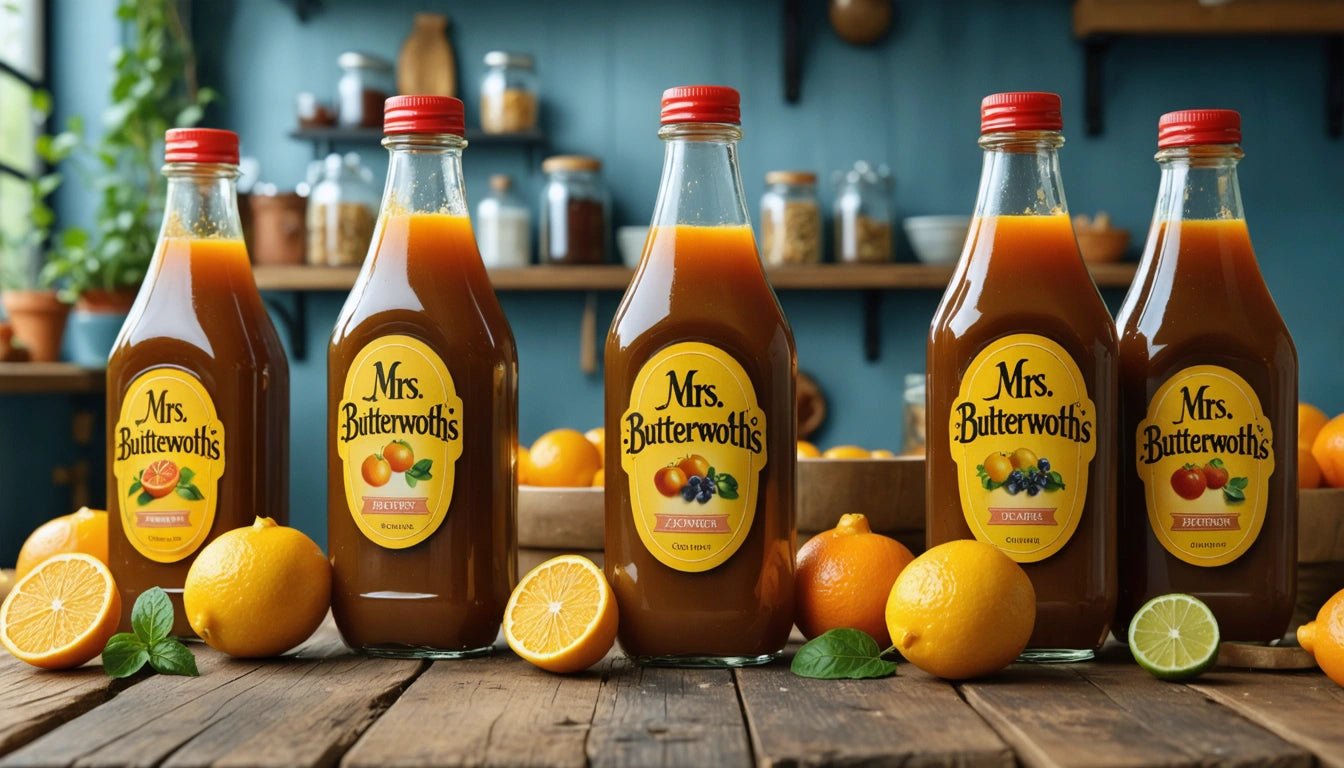
Few food packaging designs have sparked as much discussion and controversy as the iconic Mrs. Butterworth's syrup bottle. Since its introduction in 1961, the motherly figure-shaped container has become a recognizable fixture in American households. However, in recent years, questions about the racial implications of the character have prompted significant changes to the brand's identity and packaging design.
The Origin and History of Mrs. Butterworth's
Mrs. Butterworth's syrup first appeared on grocery shelves in 1961, created by the Pinnacle Foods Corporation. The brand's unique selling proposition was its distinctive bottle, shaped like a matronly woman in a long dress, representing the epitome of maternal warmth and homestyle cooking. The glass bottle design was revolutionary for its time, creating an immediate visual identity that set it apart from competitors.
The character was initially marketed as a grandmotherly figure who took pride in her rich, thick syrup. Early commercials featured the bottle coming to life through animation, speaking in a warm, nurturing voice about the quality of the product inside. This anthropomorphic marketing approach helped establish an emotional connection with consumers, particularly families with young children.
Brand Identity and Character Development
Throughout its history, the Mrs. Butterworth's character has been positioned as the embodiment of maternal care and breakfast-time comfort. The brand's marketing consistently emphasized the "thickness" and richness of the syrup, drawing parallels between the product quality and the nurturing nature of the bottle's maternal shape.
Interestingly, while the bottle had a distinctive silhouette, the early marketing materials never explicitly defined Mrs. Butterworth's racial identity. The character was voiced by white actresses in commercials, including Mary Kay Bergman and Tress MacNeille, yet the amber-colored glass bottle created ambiguity about the character's intended ethnicity.
Voice and Personality Evolution
The personality of Mrs. Butterworth evolved through decades of advertising campaigns. Initially portrayed as a magical grandmother figure who literally came to life to the delight of children, the character later developed a more sophisticated personality in advertising aimed at adults. Throughout these changes, the bottle design remained relatively consistent, becoming one of the most recognizable packaging shapes in American grocery stores.
Racial Controversy and Public Perception
The question "is Mrs. Butterworth black" gained prominence during the racial justice movements of 2020. Critics pointed out that the character's design shared problematic similarities with racial stereotypes like the "mammy" caricature, a depiction of Black women as happy domestic servants that was common in post-Civil War America.
Conagra Brands, the current owner of Mrs. Butterworth's, faced increasing pressure to address these concerns. The company acknowledged that the character's design could be interpreted as perpetuating racial stereotypes, even if that wasn't the original intent. This recognition came alongside similar reckonings for other food brands with problematic racial imagery, including Aunt Jemima and Uncle Ben's.
The Bottle Redesign Journey
In June 2020, Conagra Brands announced a complete review of the Mrs. Butterworth's brand packaging. This announcement directly addressed the mrs butterworth bottle change that many consumers and activists had been calling for. The company stated it would work to ensure the brand did not inadvertently contribute to systemic racism.
The redesign process involved several stages of consumer research, design exploration, and cultural sensitivity reviews. While maintaining the recognizable silhouette that consumers associated with the product quality, subtle changes were made to move away from potentially problematic elements. The company also shifted marketing focus toward the product itself rather than the character.
Material Changes and Modern Manufacturing
Beyond addressing cultural concerns, the mrs butterworth history includes significant changes in bottle materials over the decades. The original glass bottles gave way to plastic in many markets, reflecting broader industry trends toward lighter, more durable packaging. These packaging evolution patterns mirror those seen in other iconic containers like Coca-Cola bottles.
The manufacturing process for these distinctive bottles has always been more complex than standard containers. Similar to how specialty shaped pre-roll cones require custom production methods, the Mrs. Butterworth's bottle demands specialized molding techniques to achieve its recognizable silhouette while maintaining functionality.
Cultural Impact and Marketing Evolution
Mrs. Butterworth's has maintained cultural relevance for over 60 years, appearing in television shows, movies, and even becoming the subject of collector communities. The bottle's distinctive shape has been referenced in popular culture, sometimes affectionately and other times critically.
The brand's marketing strategy has evolved significantly over time, moving from character-focused advertising to more product-centric messaging. This shift reflects both changing consumer preferences and increasing awareness of problematic racial depictions in advertising. Modern campaigns focus on the syrup's flavor and quality rather than the anthropomorphized bottle character that dominated earlier advertising.
- 1960s-1980s: Character-focused advertising with the bottle "coming alive"
- 1990s-2000s: Family-centered marketing with less emphasis on the talking bottle
- 2010s: Product quality messaging with the bottle as a visual icon
- 2020-Present: Redesigned packaging with emphasis on ingredients and flavor
The Future of Iconic Food Branding in a Changing World
The Mrs. Butterworth's controversy represents a broader reckoning in the food industry about how brands represent and market products with historically problematic imagery. Companies must now balance brand recognition and heritage with evolving social consciousness and inclusivity.
For brands with iconic packaging like Mrs. Butterworth's, the challenge lies in preserving brand equity while addressing legitimate concerns about racial stereotyping. The most successful approaches involve transparent communication with consumers about the reasons for changes while maintaining product quality and recognition.
This evolution parallels changes seen in other industries, from beverage logo evolution to clothing brands retiring controversial mascots. In an increasingly diverse marketplace, brands that proactively address problematic elements of their identity are better positioned for long-term success.
As consumer awareness continues to grow regarding the historical context of marketing imagery, brands like Mrs. Butterworth's will need to continuously evaluate their visual identity against evolving social standards. The most resilient brands will be those that can acknowledge problematic aspects of their history while evolving to reflect contemporary values without losing their core identity.